
SEE ALSO: How to Make Your Blog as SEO Effective as Possible
 |
| License: Creative Commons image source |
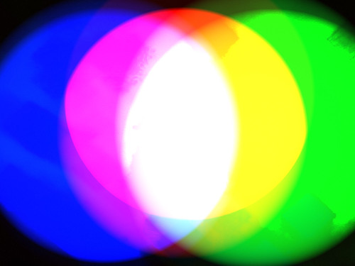
Play with your color
Color plays an important role in making someone carry out a specific action. We’re going to focus on your links at the moment because you want people to click on them. It could be a buy-now button or just a normal hyperlink somewhere inside an article. You’ll be surprised to know the color you use might not matter too much, and the important thing is that you use the same color all through your site wherever you have a link you want the visitor to click on.
 |
| License: Creative Commons image source |
Use more buttons
We’ve talked about the color of links, but which one is best: buttons or text links? Ask yourself whether you would rather click on a button, or on a piece of text that was hyperlinked. A button is obviously more clickable, so you should definitely use them as much as possible. You also have to remember that most people are not very internet savvy and they might not know they need to click on a normal link. A button makes it obvious what they should do.
The importance of images
Images are very important because we are all very visual and looking at a pretty picture makes us feel good. If you wanted to buy a product online the image that goes along with it would have a big impact on your decision. Think about Amazon and the importance of book covers. When you are looking for a new book you don’t have any idea what they’re about. The front cover makes a book stand out. I guess that means a better image equals better results.
| License: Creative Commons image source |
Tell them what to do
If you don’t tell people what to do it will definitely lower your conversion rate because people are naïve. Not everyone, obviously, but some people won’t know what you want them to do unless you write a command and surround it with flashing lights. ‘Click here’ is something you’ve probably seen a million times when you’ve been browsing online and that is because it works. You can go too far, so make sure you’re strict, and not rude.
 |
| License: Creative Commons image source |
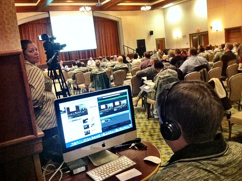
Add videos
A picture might be the same as a thousand words, but a video is the same as a million words. If you want your design to look better a video also looks great because it helps to break up the text, which can sometimes get a little overwhelming. If you don’t use any videos on your sales pages you should definitely test them out because your conversion rate could go through the roof. Make sure you use decent equipment so the video looks good.
 |
| License: Creative Commons image source |
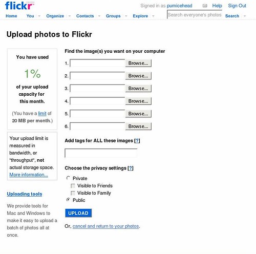
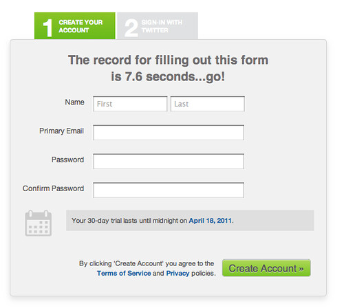
Simplify forms
You probably get scared away when you see a form that asks you to fill out a million different fields. You’re not applying for a loan, so why do they want so much information? If you can simplify your forms you will get more people entering their details because nobody likes hard work. Just take out certain fields if you don’t really need the information. You will make more money that way, but at the moment you might be throwing it all away.
 |
| License: Creative Commons image source |
Feel free to leave your comments below.
Today’s featured contributor, Neena Jones, works for a professional website company in Toronto. She likes to blog and often shares her thoughts and views on how a website should look. In her free time, she likes to indulge in traveling and adventure sports.


